

Duration
2 months
2021
Team
UX Designer x2
Developer x1
Taste Now, Buy Later
A case study reimagining the online tea shopping experience by bridging the digital and physical customer journeys.
My Contribution
UX Research
UX/UI Design


Harney & Sons wants to use online shopping to grow its local tea business.
Harney & Sons is a 3rd generation local tea business located at the heart of SoHo, NYC. In recent years, the business has expanded its product lines outside of traditional flavors with unique blends to attract more types of tea drinkers.
OVERVIEW
01

BUSINESS GOAL
Exterior and interior of Harney & Sons, SoHo

PROBLEM
People prefer tea shopping in person instead of online.
Shopping tea online is like buying groceries.
People are reluctant to commit to something when they can’t guarantee its quality or haven’t tried. On the contrary, people enjoy browsing the endless tea catalog in person.
How might we make online tea shopping as easy and pleasant as in person?
DESIGN CHALLENGE

SOLUTION


Let’s bring a tea room online!
“Tea Room” is an interactive feature like “Wishlist” that appears on the shop page to let customers add products to.
But instead of adding products to the cart, customers add them to the “Tea Room”.
With a quick reservation, customers are scheduled to taste their new favorite tea in person at no cost.
When facing uncertainty or unknown, what people hate is commitment. What they like are options.
PROCESS
02
MARKET RESEARCH
80% of people prefer shopping tea in person to ensure the quality of it, and 50% of online shoppers are returning customers who already trust the brand.


USER RESEARCH
Interviews revealed that in-person and online journeys are two different experiences.
I conducted 6 interviews on tea drinkers who have experience shopping tea online. Through synthesis, we discovered that shopping in-store vs online are two different customer journeys that lead to different outcomes.
User interviews and user testing of the current site revealed 2 pain points from the online tea shopper’s journey.
Online tea shoppers expressed that tea websites have poorly designed and disorganized site navigation that can be overwhelming for customers to browse and explore. Through user testing of the current site, 3/3 failed to discover the right product.
PAIN POINTS


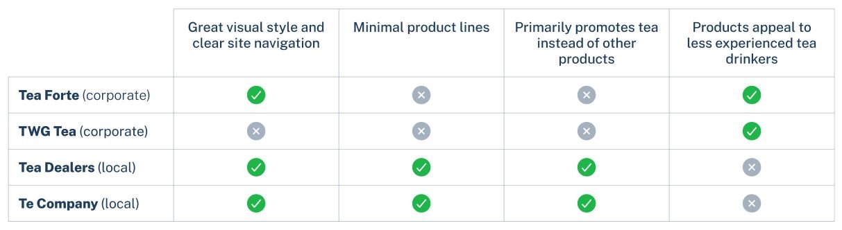
C&C ANALYSIS
Existing products revealed that tea websites with fewer product lines have clearer site navigation and product groupings.

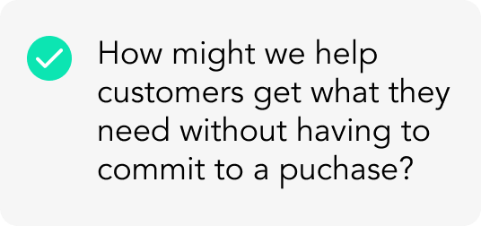
How might we make tea browsing as pleasant and easy as possible?
OPPORTUNITY 1
SITE MAP
The consolidated site map provides a more clear and direct path for customers to browse and find the right product.
Learning from our card sorting results, our strategy to reorganizing the information architecture is to consolidate the primary navigation into just 3 main categories to provide more direct path to the right product.


SITE NAVIGATION
Consistent product grouping and naming allow customers to browse easily without being overwhelmed or lost.
Learning from our card sorting results, our strategy to reorganize the information architecture is to consolidate the primary navigation into just 3 main categories to provide more direct path to the right product.


Existing Global & Secondary Navigation:
Improved Global & Secondary Navigation:


Cluttered and disorganized global navigation
Product category naming unclear and confusing
Product information redundant
Product category naming confusing and repetitive in other tabs


Clear and minimal global navigation
Product naming and grouping consistent
Product information organized by categories


HOME PAGE
Improved home page and site navigation provide customers a pleasant and easy way to browse, explore, and purchase.
How might we help customers get what they need without commiting to a purchase?
OPPORTUNITY 2
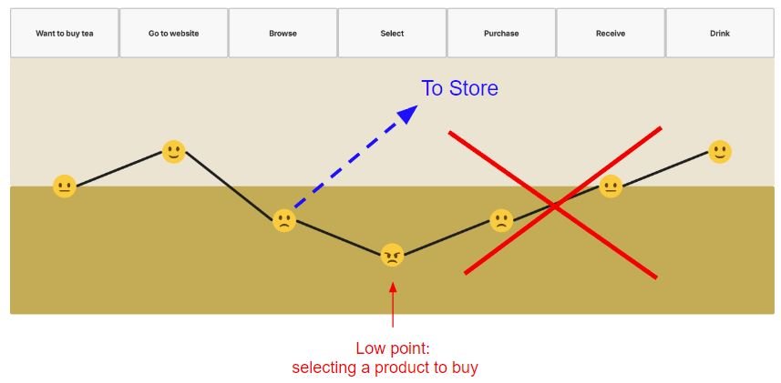
CUSTOMER JOURNEY
If in-person shopping leads to a delightful experience and a successful purchase, we should integrate the online journey to it.

Integrated User Journey:
Reimagined user journey:

HAPPY PATHS
When faced with a decision to buy, customers are given options to either make the purchase or continue to store.


SHOP PAGE

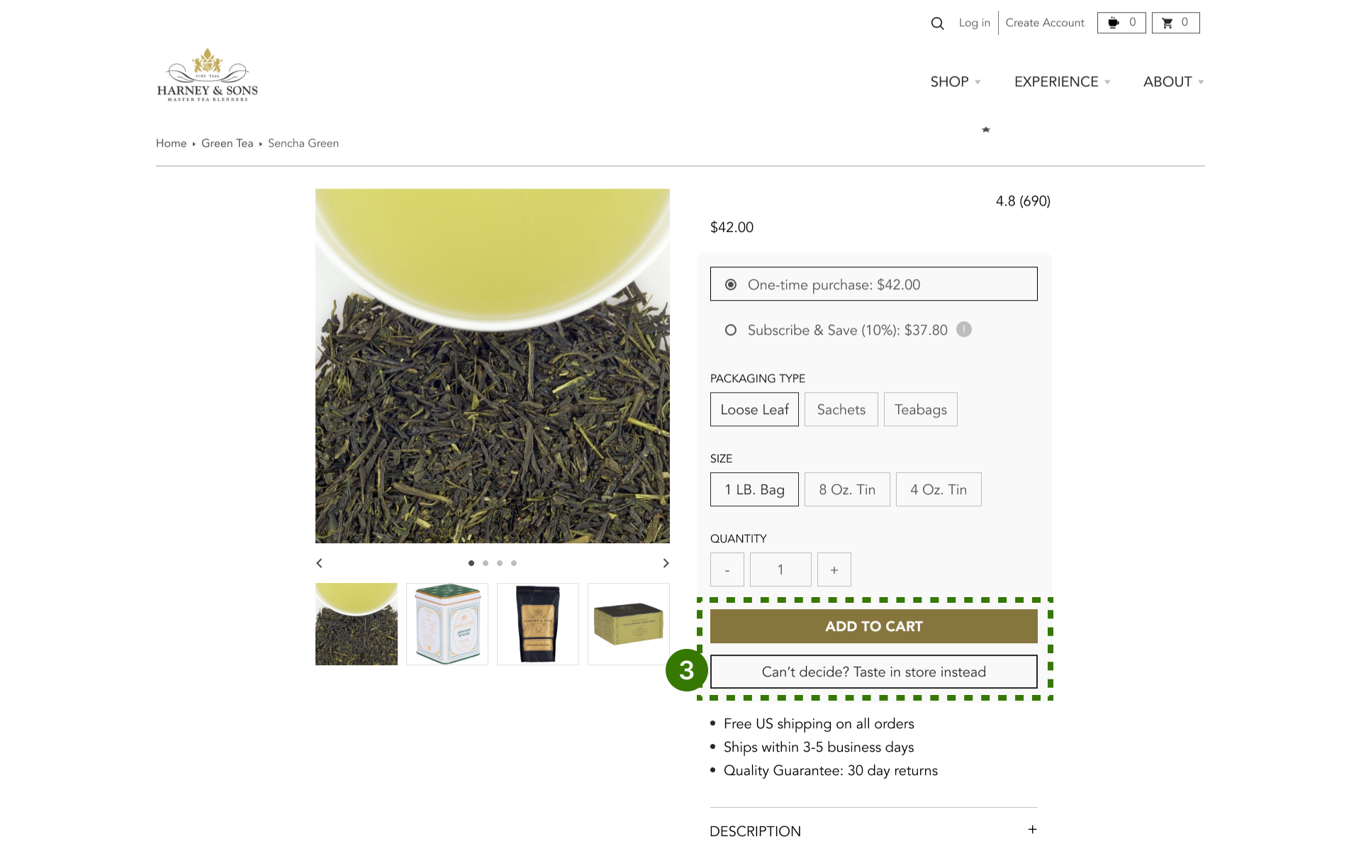
PRODUCT PAGE

RESERVATION PAGE

Customers can add any product from the shop page.
Once added, the product is shown to be in the tea room.


Customers also have the the option of adding to team room instead of purchase on the product page.

Once clicked on the tea room, customers can make a reservation once a date, time, and basic contact information are entered.
FEATURE VALIDATION
The Tea Room was only located on the product page initially. Through testing I learned this needs to be introduced to customers earlier.
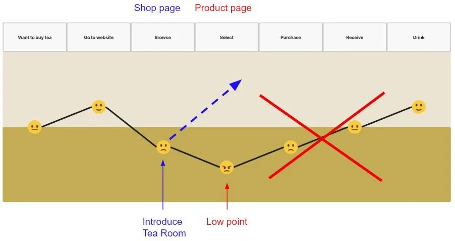
If the low point of the customer journey occurs when they’re selecting a product, why not introduce it as soon as they start browsing the products?

I originally only placed the tea room access as a secondary CTA below the primary “Add to Cart” button on the product page. Only 1/3 testers were able to identify this feature.
USER TESTING
03


After spending a timed amount of time on shop & product page, a CTA will appear on the screen.
Once clicked on, customers are given an simple instruction of how to add products to the Tea Room.
DESIGN ITERATION
NEXT STEPS
Get business buy-in on the Online Tea Room business model.
The Online Tea Room requires additional effort and planning from both frontstage and backstage operations and is important to discuss the feasibility with the business.
Further user testing on Online Tea Room feature with actionable KPI targets.
Once the Tea Room is implemented on the website, the business can start testing and measuring with a variety of metrics how the feature betters the overall business.
REFLECTION
04
WHAT I LEARNED
Sometimes the solution is outside the screen.
Before the inception of the Online Tea Room came about, I felt as though the only solution to better the ecommerce experience is to improve the overall site navigation and design. But by thinking outside the screens (outside the box), I realized we can provide a connection from the digital world to the physical world with just one button.